David Walton

Before we address the various components of a best-practice dashboard, we need to define the purpose of the PMO dashboard and who the audience of the dashboard is.
Typically, the audience of a dashboard is senior stakeholders who want to see the status of their projects.
You can, of course, have dashboards at project, programme, and portfolio levels.
The PMO will typically produce dashboards at the portfolio and programme level. Project dashboards are produced by the project manager.
For the rest of this blog let’s assume that we are talking about a portfolio dashboard.
This is a step that is often overlooked resulting in a dashboard being produced that is too generic. It is likely that your portfolio dashboard may have more than one user or viewer.
Different stakeholders may want to see key information about different or even multiple portfolios. So, the first step is to make your dashboard configurable so that it can show different portfolios for different users or sponsors.
Keeping with the audience theme, different users may want to see different information from the same portfolio dashboard. It is ideal, therefore, to have a superset of dashboard components that a user can pick and choose for their particular purpose.
For example, a corporate risk auditor may want to focus on portfolio risks and may not be that interested in progress against schedule. The portfolio owner may be less concerned with risks and more concerned at how well the portfolio is meeting the organisational strategic objectives.
To address these multiple requirements, you need a set of dashboard components that can be configured for different users. So, the portfolio needs to be configurable and the components need to be configurable.
A dashboard, by definition, is a high-level summary of information in a portfolio, programme, or project.
If we stick with the portfolio dashboard theme, it is important that the dashboard user can click on a component and then drill down to view more information.
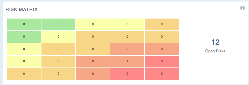
For example, a dashboard may contain a matrix of risks, like the one below from PM3, our PPM tool. If there are a number of risks in the red zone you would want to understand more information on these risks.
For example, you may want to see which project the red risk comes from and then drill down further to see the actual risk description, mitigation, etc. of the actual project risk.

PM3, Risk Dashlet
These three simple but important steps will help you design good quality and informative PMO dashboards. In our next blog on dashboards, we look at the components of a good portfolio dashboard.

Our products help you deliver successful change programmes and projects by always focusing on the overall business outcomes. Find out how our products can help you.
Tell me more Request a demoIn this blog, our resident PMO expert David Walton, gives his take on why the NHS is leading the way...
Read more >You may have heard of a black swan in an avian context or are thinking of a Natalie Portman film, bu...
Read more >As a project manager you are under great pressure to deliver your project on budget, on time and to ...
Read more >