To visualise risks effectively, teams need to capture and analyse large volumes of data — but the real challenge is communicating that information to stakeholders in a way that is clear, concise, and builds confidence.
In this article, PMO expert and principal consultant at Bestoutcome, Tim Schmeising-Barnes, outlines a practical five-stage approach to data visualisation, showing how risks can be presented more clearly at each stage of a project.
One of the issues I always had with risks was the sheer volume of information that is RELEVANT to any risks.
Start with the data to evaluate the risk – Severity; Likelihood; Controllability – multiply by the 3 phases – Initial; Current; Target – and add all of the relevant information about Status, Impact, Trend, Cost, Weighted Cost, Response Type, Mitigation, Risk Owner, Raised By, Date Raised, Completion Date, etc. and you can easily exceed 50 fields (try it yourself and see).
Let’s put that in Excel terms, each risk has columns A to AZ (and possibly more). Even using A3 paper, that’s not printable.
Get down to 20 columns and it’s still unwieldy and 10 columns means you are lacking key information.
So, risk logs are great for capturing all that juicy risk information but not so great for easily understanding the whole risk profile.
The answer is two-fold. Firstly, risks need many different perspectives or views (what’s urgent, what’s important, are we managing the risks, which areas are the highest priority, etc) and, secondly, it’s really useful to have visualisations to show what is happening.
With a chart or graph, you can quickly convey general trends (getting better or worse) as well as more nuanced information (rate of change, key areas of concern, etc).
A side benefit of using visualisations comes from the psychology of looking at charts and graphs and drawing conclusions from them.
Because the viewer will interpret the images you give them, they will have greater confidence in the conclusion (assuming that the data supports your conclusion!).
There are many different visualisations available and they all have pros and cons but there are a few general guidelines:
The definition and treatment of risks is fairly consistent throughout the project lifecycle but the ways of depicting your risks can and should change as you move through different stages.
Below are some suggested approaches. Referring back to rule 1 (above), you probably won’t want to use all the examples but they give you some ideas to choose from.
When you start, it’s a great time to establish your core visuals. These should be simple to create but convey enough information to keep people informed.
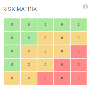
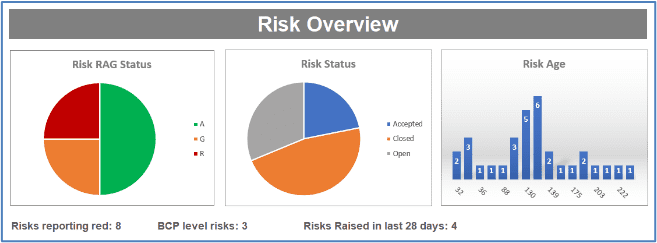
Here we have some standard measures to give the audience an overview of how risk is being managed. Note a few stats to accompany the charts and give extra information.
These visuals say “we have risks under control” which allows the discussion to focus on key
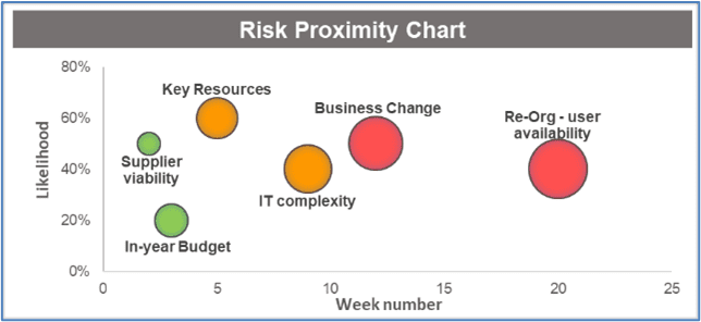
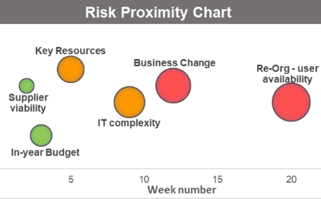
Important is not the same as Urgent. A Risk Proximity chart is a great way of focussing on what needs attention now and what can wait.
With time (and change of project scope) some risks may even just go away! The key date is the date when action is needed, not when the risk will impact the project!
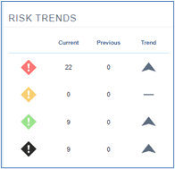
By the 3rd stage, you will start to have valuable historic information. At this point Trend analysis is really useful to help show confirm predictions.
Prior to this stage, the fluidity of the project makes it hard to have a good baseline for any measures but by now the scope and plan should be more stable and the risks likewise.
Look for 2 key trend measures, current RAG vs initial RAG and current RAG vs last month.
Stage 4 is about getting everything right for operation. At this point nice simple countdowns and checklists show that the outstanding risks are diminishing and (hopefully) everything is heading to Green ready for a successful launch.
Closing stage data capture
And finally, Close. At this point you should have closed or transferred risks to new owners until the only risks left are related to the benefits realisation.
You might also want to create some graphics to show the way risks were managed eg number of risks that became issues, average mitigation time, red risks actioned, etc.
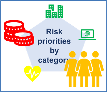
Most of the examples shown are fairly standard risk visualisations which makes life simpler for everyone. However, a custom graphic can be a quick and effectively way of keeping stakeholders informed.
Here is an example where the distribution and rating of risks across different categories can be summarised using simple icons, variable size, and 3 colours.
Your trusty risk register is still critical for all of the data you need but with some good visualisations it needn’t be the primary way you communicate risks to your stakeholders.
Risk registers remain essential for capturing detail, but they are rarely the best way to communicate risk.
As projects progress and the volume of information grows, the ability to visualise risks becomes increasingly important. When teams visualise risks clearly, they make it easier for stakeholders to understand priorities, trends, and areas that need attention without having to interpret dozens of data fields.
Different stages of a project require different perspectives, which is why a single view is rarely sufficient. The examples outlined show how teams can visualise risks in ways that reflect urgency, severity, progress, and control at each point in the lifecycle.
By choosing the right visuals at the right time, it becomes possible to visualise risks in a way that supports discussion rather than overwhelms it.
Consistency also matters. When audiences become familiar with how risks are presented, confidence in the information increases. Over time, this makes it easier to visualise risks, compare change, and spot emerging issues early.
Well-chosen visualisations help teams visualise risks as patterns and movement, not just static entries in a register.
Ultimately, the goal is not to replace the risk register, but to complement it.
Used together, structured data capture and clear visual communication allow organisations to visualise risks accurately, discuss them more effectively, and make better-informed decisions.
When teams learn to visualise risks consistently and appropriately, risk management becomes clearer, more transparent, and far more useful throughout the project lifecycle.
Image: Astrid.IQ

Our products help you deliver successful change programmes and projects by always focusing on the overall business outcomes. Find out how our products can help you.
Tell me more Request a demoThe majority of PMOs that are, what we call ‘value-adding’ PMOs, will need to produce dashboards...
Read more >It is hardly big news but the level of change is increasing. Any organisation that sits on its laure...
Read more >